Product designers: run the dark-mode finance dashboard already in the gallery
Use Image 3 AI's FinTech dashboard UI template — emerald candles, glass sidebar, 16:9 — then swap the product. Optional second gallery sheet: the SaaS 3D hero visual.

The gallery already has a UI mockup you can brief from. Open the dark mode FinTech dashboard, look at the emerald candlesticks and glass sidebar, then Remix into the create workspace. Image 3 AI is independent, not OpenAI. This article uses that template as Direction A. Direction B is the SaaS 3D hero visual in the same gallery — a landing illustration, not a clickable app.
That is the showcase. Interface type will not be audit-accurate. We have no Text-on-Image tool. Use the picture for layout and palette; set real numbers in Figma.
What this mockup is for
A dashboard sheet is useful when engineering and design need the same night-mode chrome: cards, a chart region, a sidebar. It is a presentation still, not a coded screen. After your generate matches the gallery, swap "crypto" for your product and keep the dark glass language.
Remix and settings
Remix loads 16:9, Flux Studio, the prompt and negative. 1K = 1344 × 768. PNG. Studio at 6 credits.
| Setting | Value |
|---|---|
| Model | Flux Studio (6 credits) |
| Aspect ratio | 16:9 (1344 × 768 at 1K) |
| Output format | PNG (Lossless) |
| Resolution | 1K |
| Negative prompt | crooked text, blurry interface, unusable layout, messy lines, cartoonish |
Gallery prompt (Direction A)
Pristine UI mockup of a dark mode crypto and investment analytics web
application, sleek card layout displaying glowing neon-emerald candlestick
charts, clean sans-serif numerical typography, subtle glassmorphic backdrop
filters, polished navigation sidebar, Figma Dribbble quality.
Keep "Pristine UI mockup" and the glass/sidebar/chart structure. Replace the domain. If the layout shears, Remix: "same dashboard, straight cards, readable sidebar, no warped panels."
Direction B — landing hero, not a dashboard
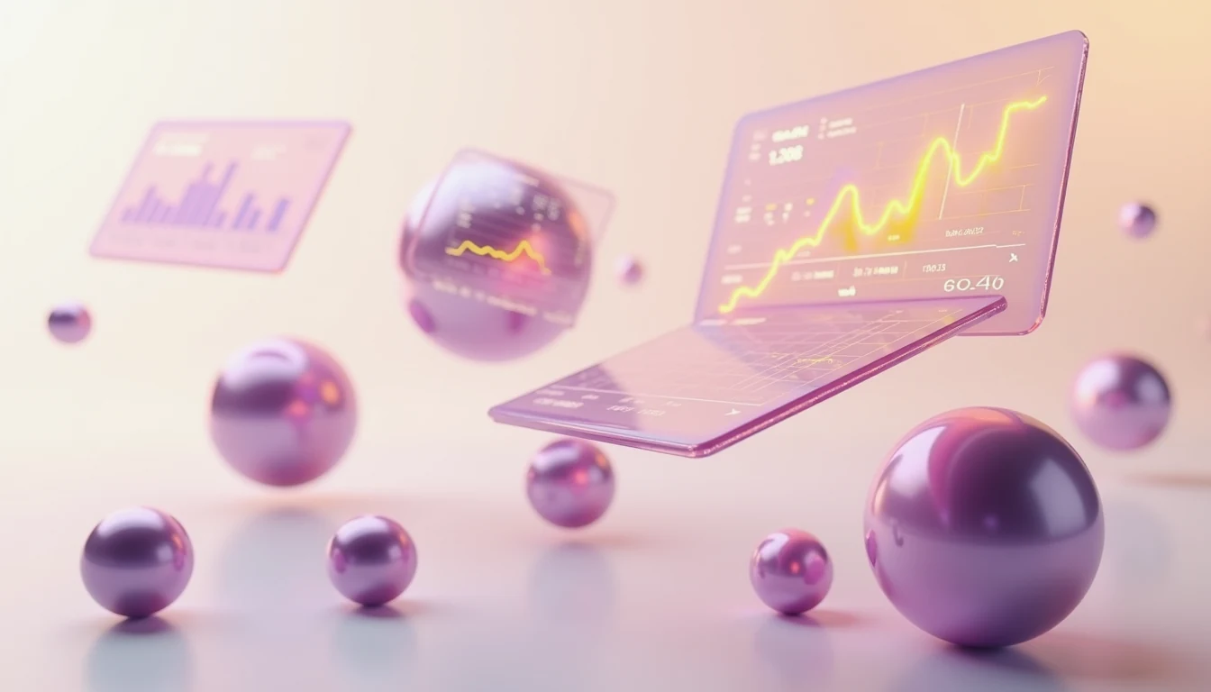
Same habit, different template: SaaS platform 3D hero visual. Frosted cards, graphs, off-white ground, 16:9. Use it when you need a marketing hero instead of an app chrome.
Flux Fast/Studio take no screenshot as a reference. To restyle a real product shot, use Reference Edit (5 credits) and a PNG/JPG/WebP ≤5 MB. The compare slider appears only with a reference.
FAQ
Why is the UI unreadable?
That's default for generated chrome. Crop the layout, replace type. Don't expect a pixel-perfect Figma export.
Fast or Studio?
Studio for this pair.
1K on a landing page?
Fine for a hero still. 2K/4K locked.
Remix the dashboard, then rename the product
Open the dark mode FinTech dashboard, generate against the showcase, then swap the product line.
Related: character turnaround template, Swiss poster.